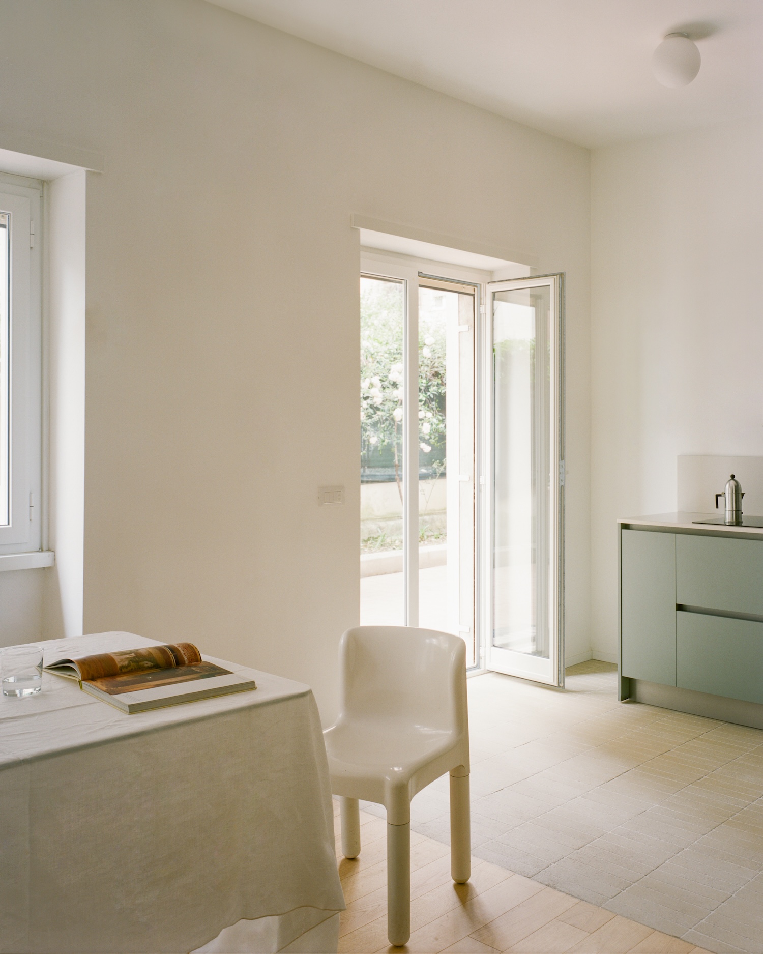
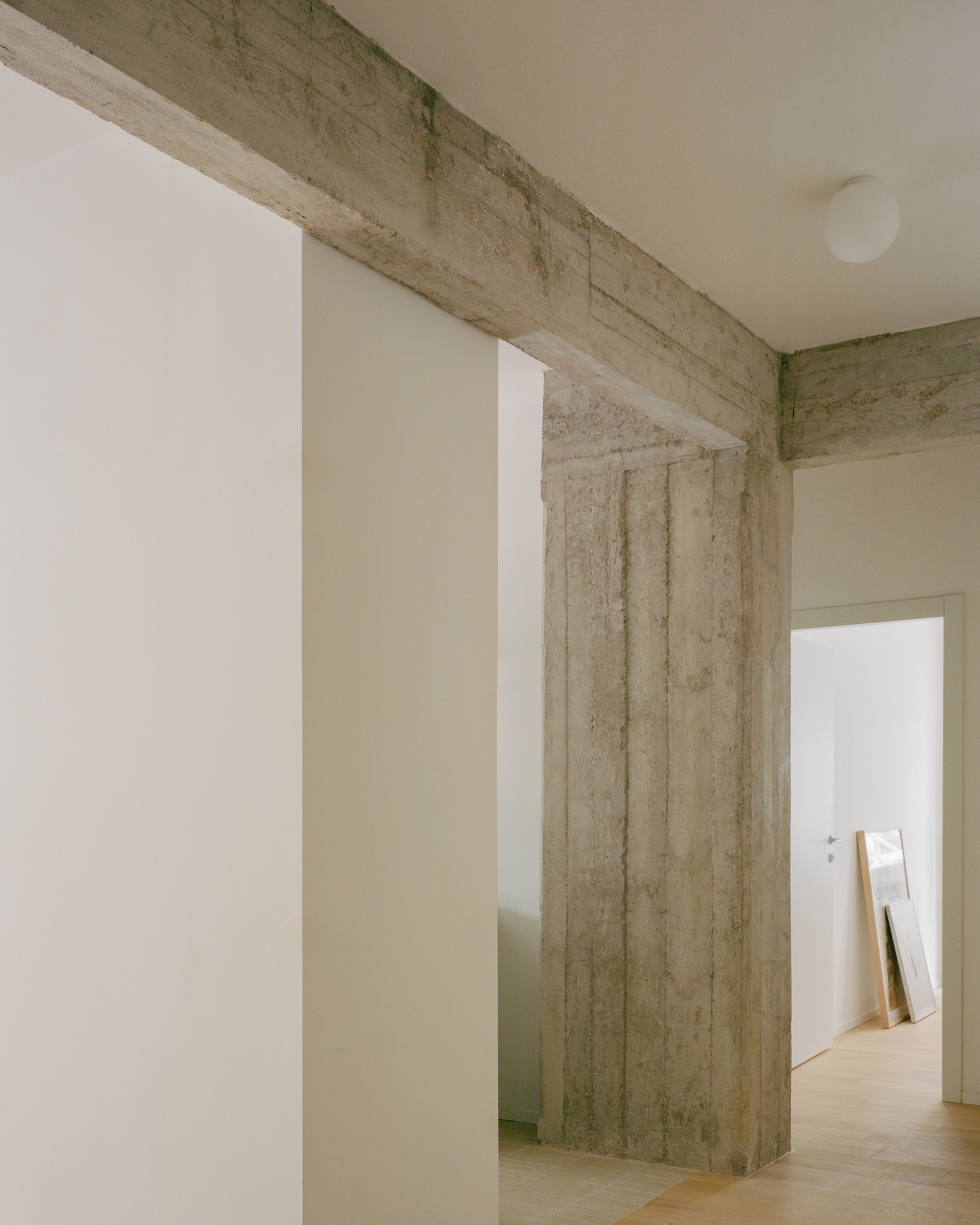
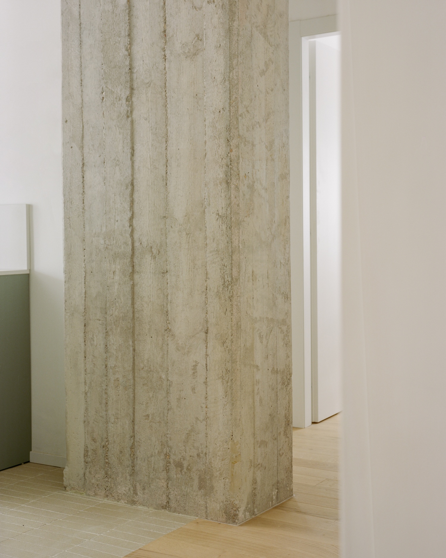
Apartment I is a minimalist apartment located in Rome, Italy, designed by ATEMPORA. The renovation begins by uncovering what the building already contained, stripping finishes back to the original reinforced concrete frame so that beams and columns resume their role as the organizing grid of the interior. This is a quietly loaded gesture in Rome, where the postwar palazzina refined concrete framing into a domestic vernacular, and where those frames were almost always plastered over the moment the building was occupied. Bringing the structure back into view returns a 110 square metre apartment to its own logic.
Light does the reorganizing. The previous plan was dark, and rather than knocking everything through into a single open volume, ATEMPORA works with controlled separations, using volumetric elements as thresholds so that rooms remain distinct while light travels between them. The result reads as a sequence rather than a floor plan, a series of conditions the body moves through, each calibrated by how much it reveals of the next.
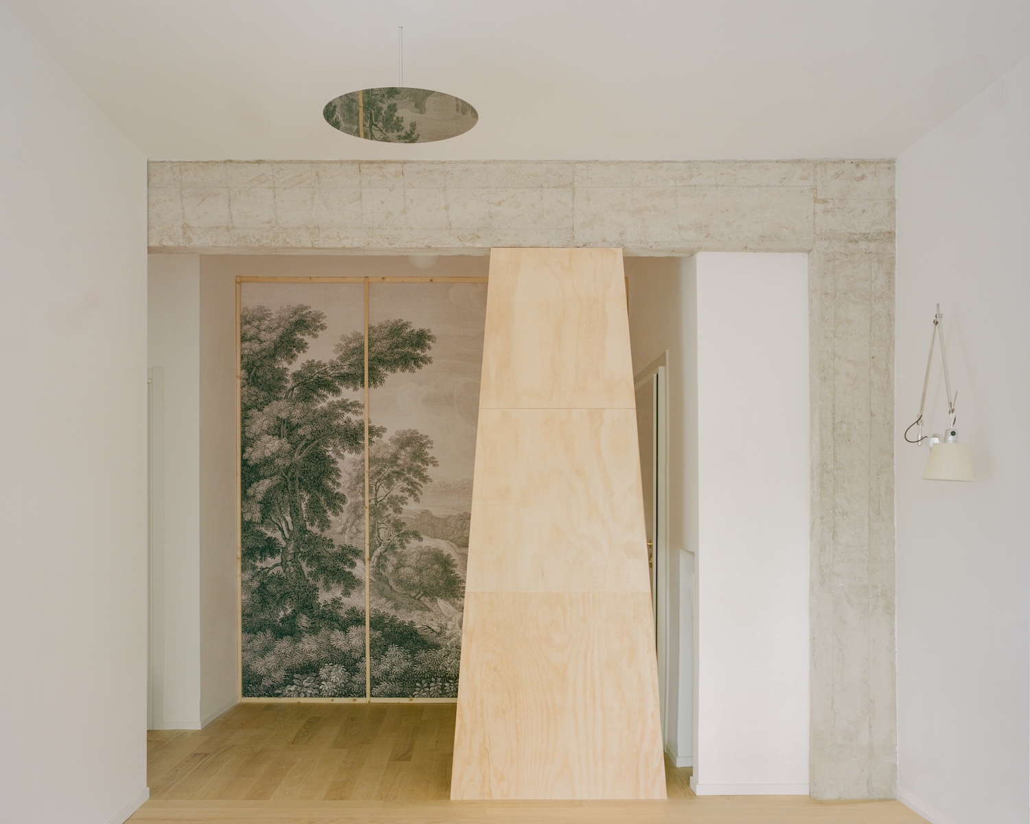
The most charged move sits at the entrance, where a full-scale print of an eighteenth century Roman rural landscape is applied directly to the wall. The image functions as a virtual window, a constructed horizon that answers the small real garden on the opposite side of the apartment. Timber framing divides the surface into panels, and the effect of those divisions is precise. They perform as muntins, insisting that the wall is a window even as the eye registers it as a picture, and that unresolved oscillation is the point. The lineage runs deep in this city, from the garden room at the Villa of Livia at Prima Porta, where a windowless space was opened onto a painted orchard, through the quadratura of Baroque ceilings, to the vedute and campagna landscapes that eighteenth century Rome exported across Europe. What ATEMPORA adds is scale honesty. A photographic print at one to one does not pretend to be paint, so the illusion is offered and withdrawn in the same instant.
At the centre of the plan, a custom plywood volume structures the passage from entrance to living areas. Plywood is the right material for the job precisely because it refuses to settle. Its laminated edges announce manufacture, its surface accepts joinery detail with cabinetmaker precision, and it can be built thick enough to read as mass while remaining hollow. The volume divides and connects, blocks some sightlines and frames others, and aligns itself with the existing structural bays without carrying any load. It borrows the authority of the concrete frame while remaining furniture, an ambiguity closer to Le Corbusier’s casiers standard or the storage walls of Charlotte Perriand than to any partition.