Apartment Saint-Gérard is a minimal apartment located in Montreal, Canada, designed by Vives St-Laurent. The project consists in renovating the first floor of a duplex located in the Villeray district, in Montreal. The unit was built in 1935 and is part of a 3-building development formerly owned by cousins. This means that the clients are the first occupants who are not part of the family. The clients, a young family, were charmed by the original architectural elements: «It’s important for us to keep a trace of the past.» The home stands out for the quality of the building before the renovations: «When we arrived, the previous owners had carefully preserved the moldings, woodwork and stained-glass windows. An original pink tapestry installed by one of the cousins was still in place. The theme color is a nod to the front door of the duplex: in the neighborhood, people call it the Pink House. However, major renovations were required to achieve a living space that is open on the backyard. The dwelling is organized in an enfilade of rooms surrounding a central corridor, which is typical of many homes in the Villeray district.
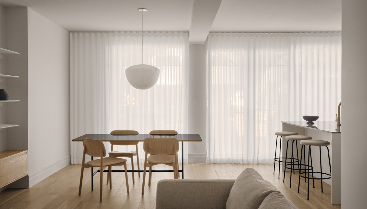
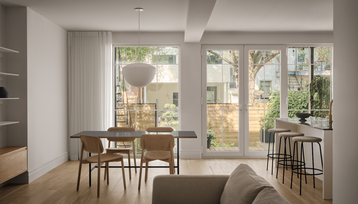
One of the major changes implemented as part of the project was the relocation of the main bathroom; the positioning of the room prevented from fully clearing the rear facade. Reorganizing the space in this manner allowed to open up the rear facade, maximizing the amount of natural light entering the main living space. French doors and large multi pane windows are a perfect fit for this space with a chic and sophisticated feel. The family wanted the kitchen, dining room and living room to be connected. All divisions were designed to provide residents with a generous amount of open space and functional private areas. On one end, you will find a compact area that includes the main entrance, two bedrooms, a walk-in closet, a bathroom, and the staircase leading to the basement.
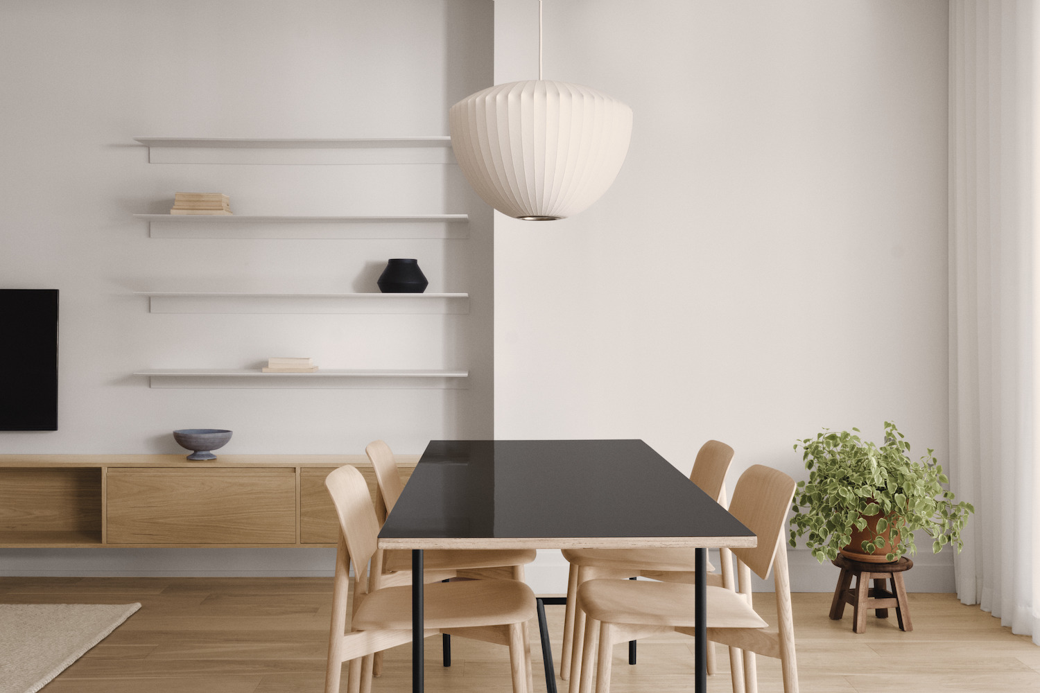
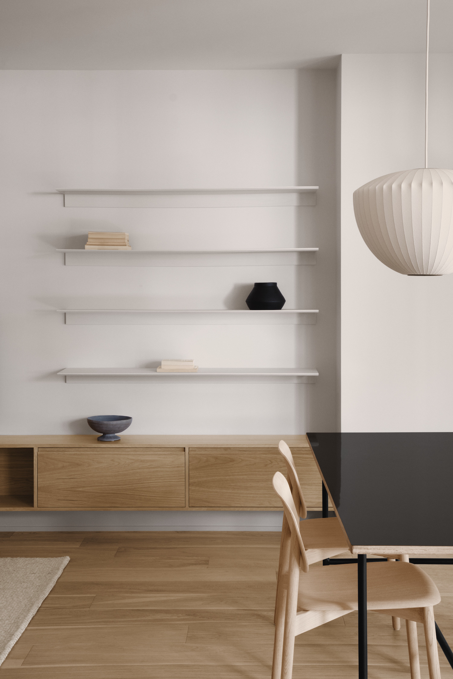
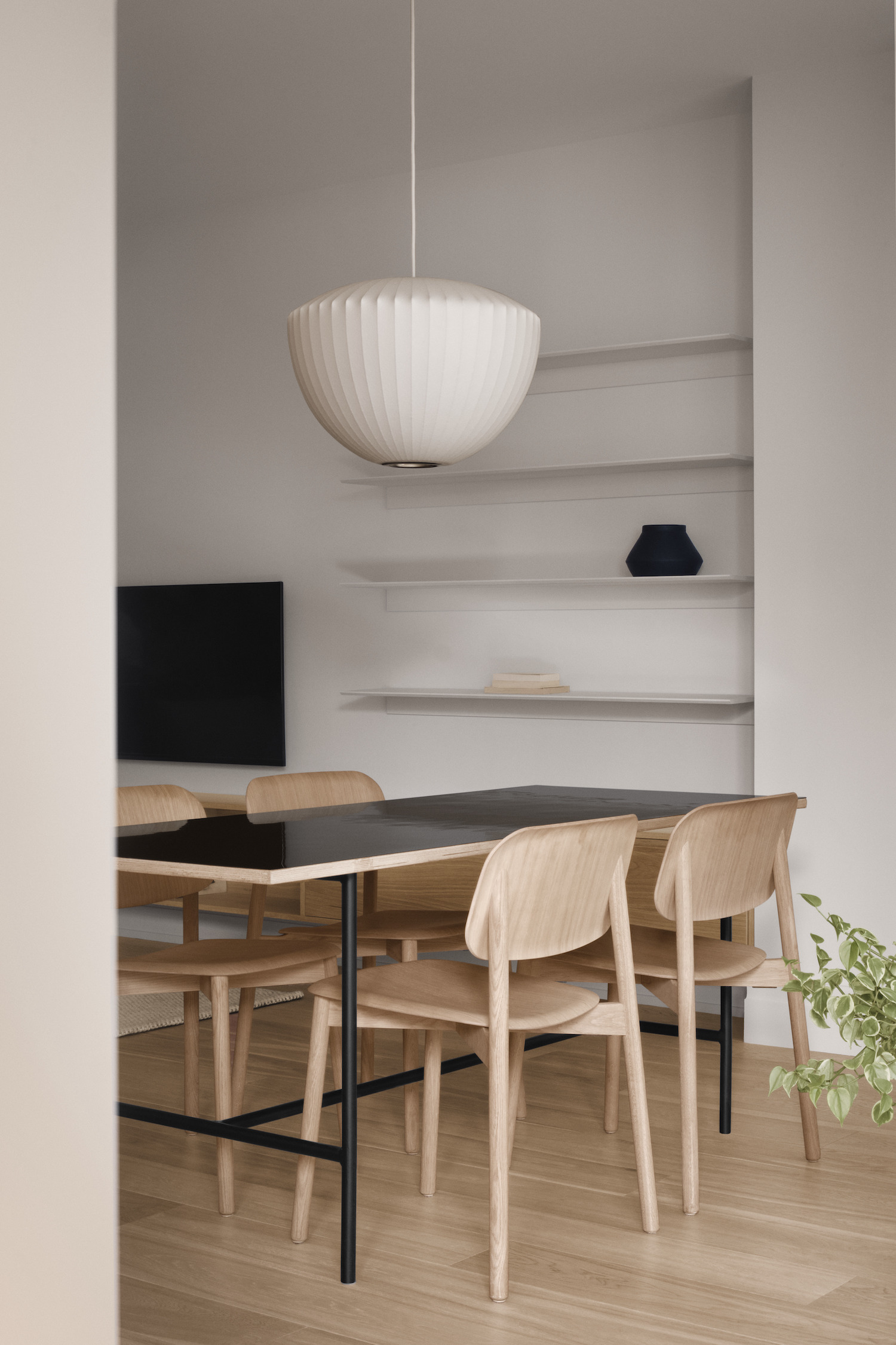
On the other side, the designers created an open area including the kitchen, the dining room and the living room. This apartment has two bedrooms located at the front of the house, one of which is configured as a master suite. The vestibule was slightly enlarged in order to improve the fluidity of this area. It was not possible to keep the original ceramic in the entrance, so the designers used the exact same mosaic pattern to evoke the original one. Wanting to preserve the character of the apartment, the clients took care to remove every wooden door and frame in order to reuse as much of these architectural elements as possible. The juxtaposition of the frame solid wood with the white oak used for the floor and built-in furniture introduces textures from different eras.
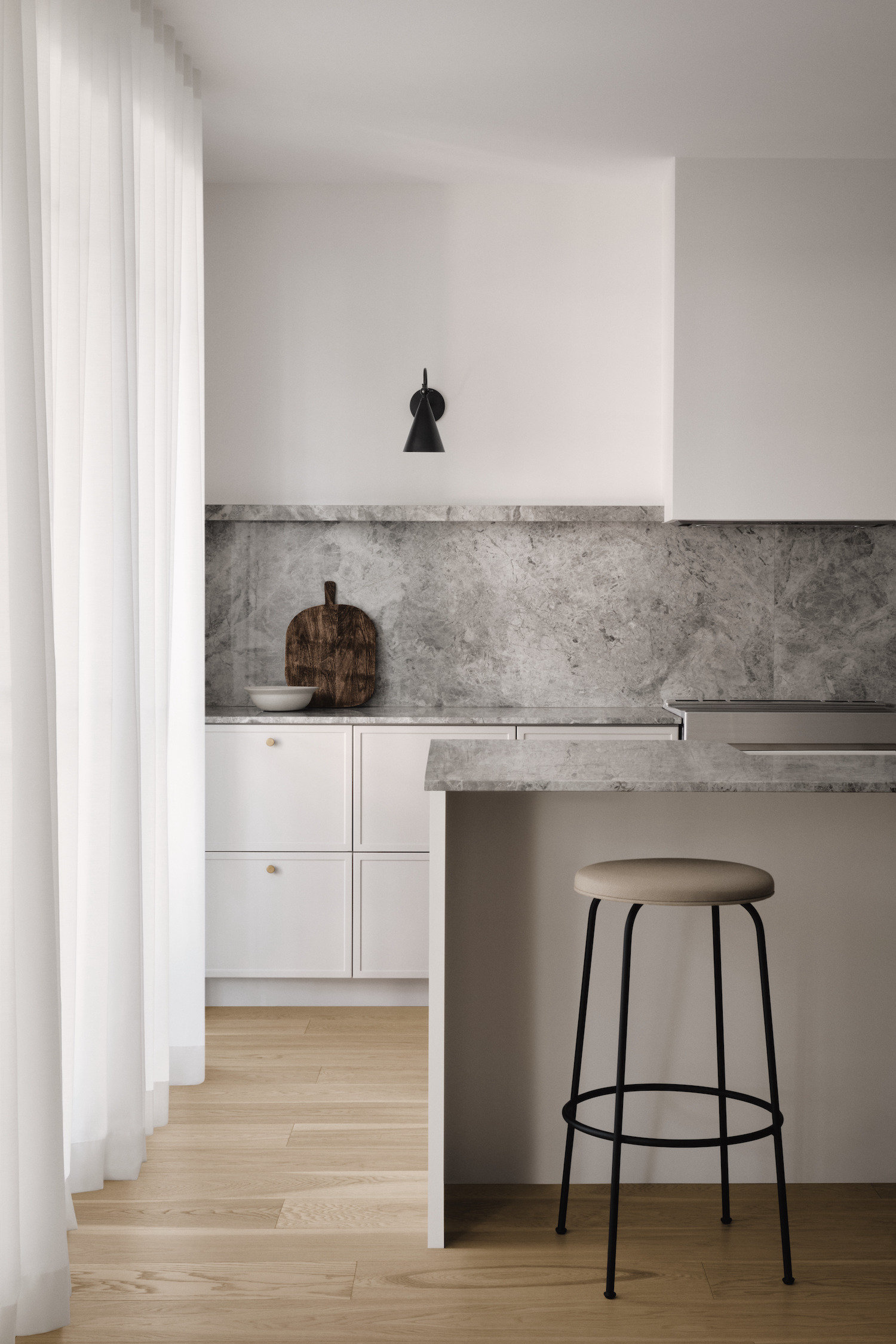
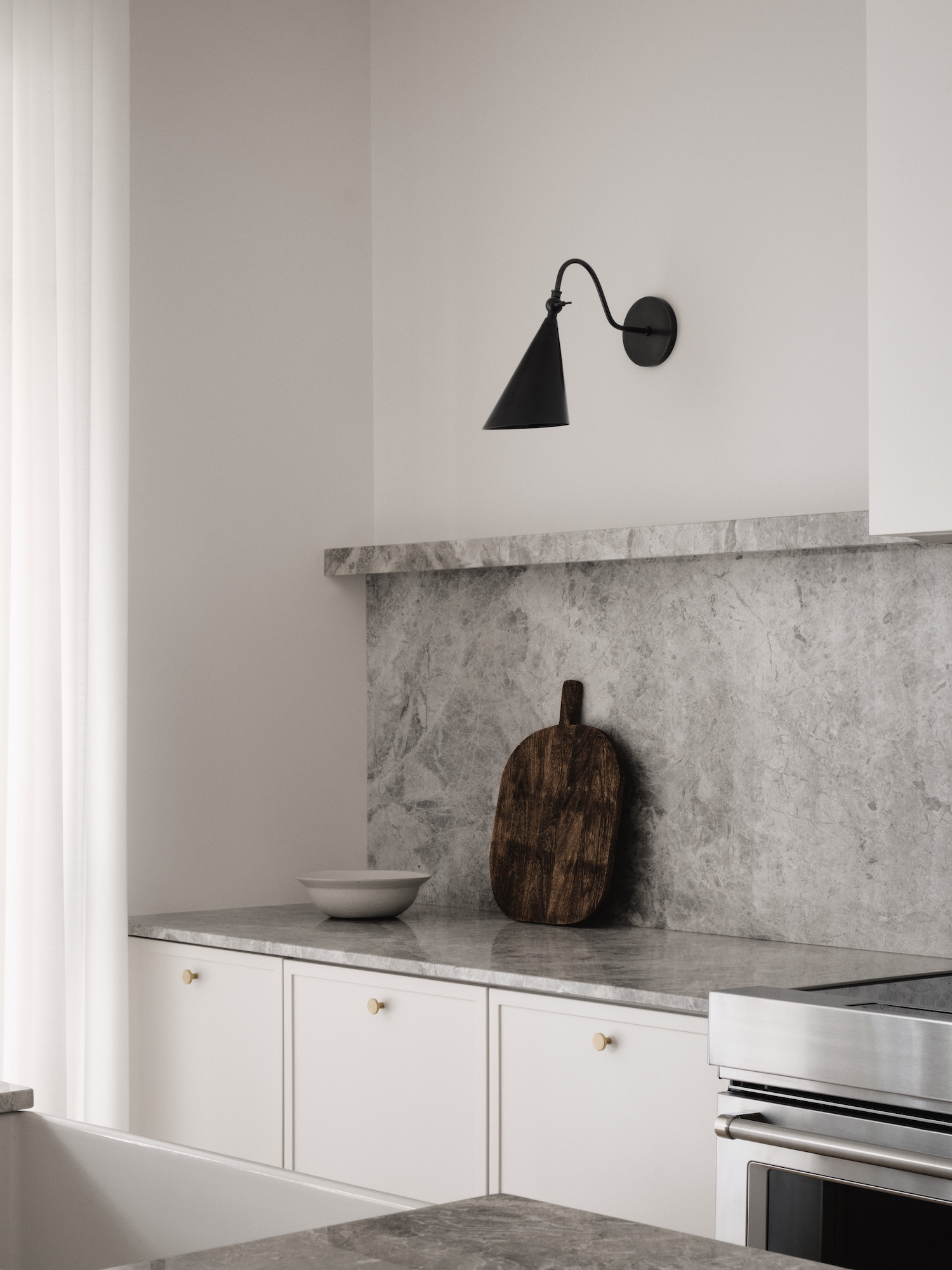
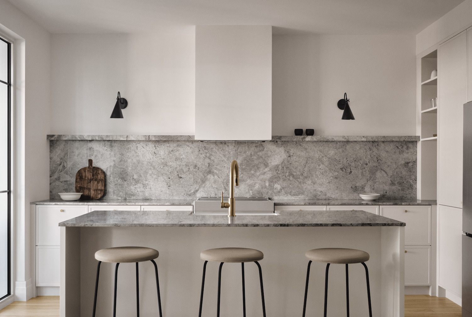
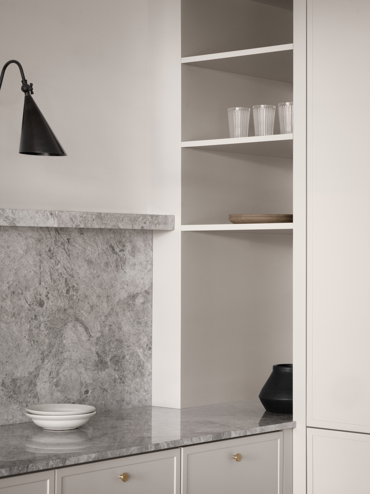
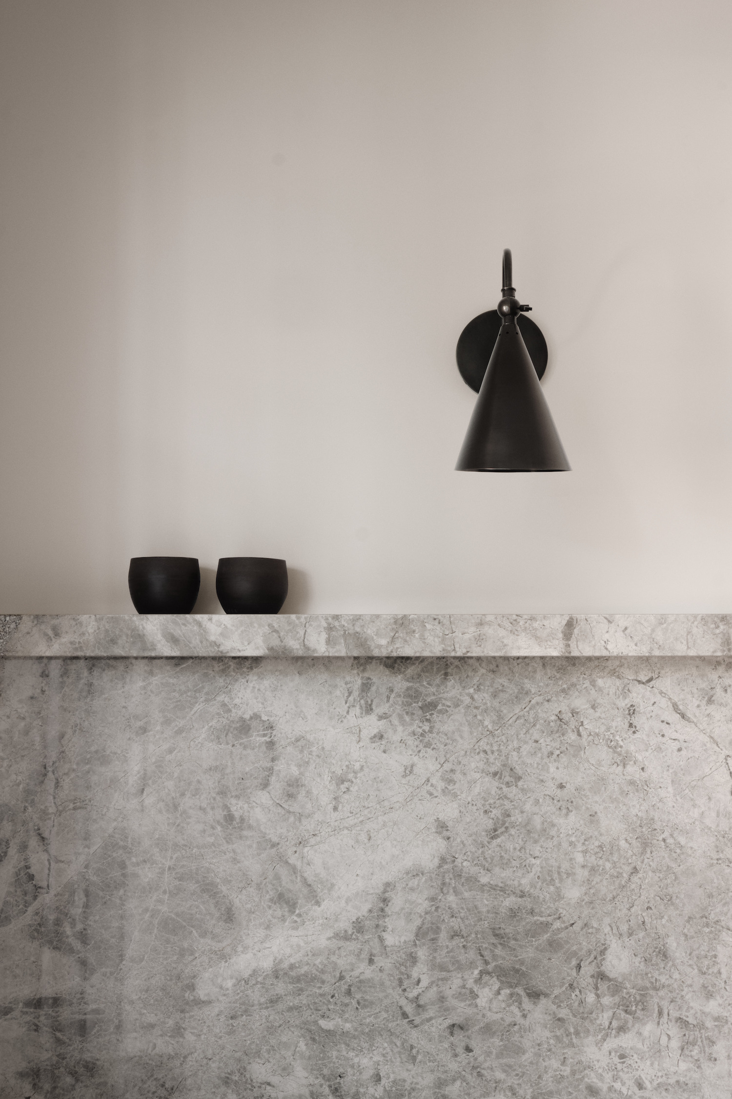
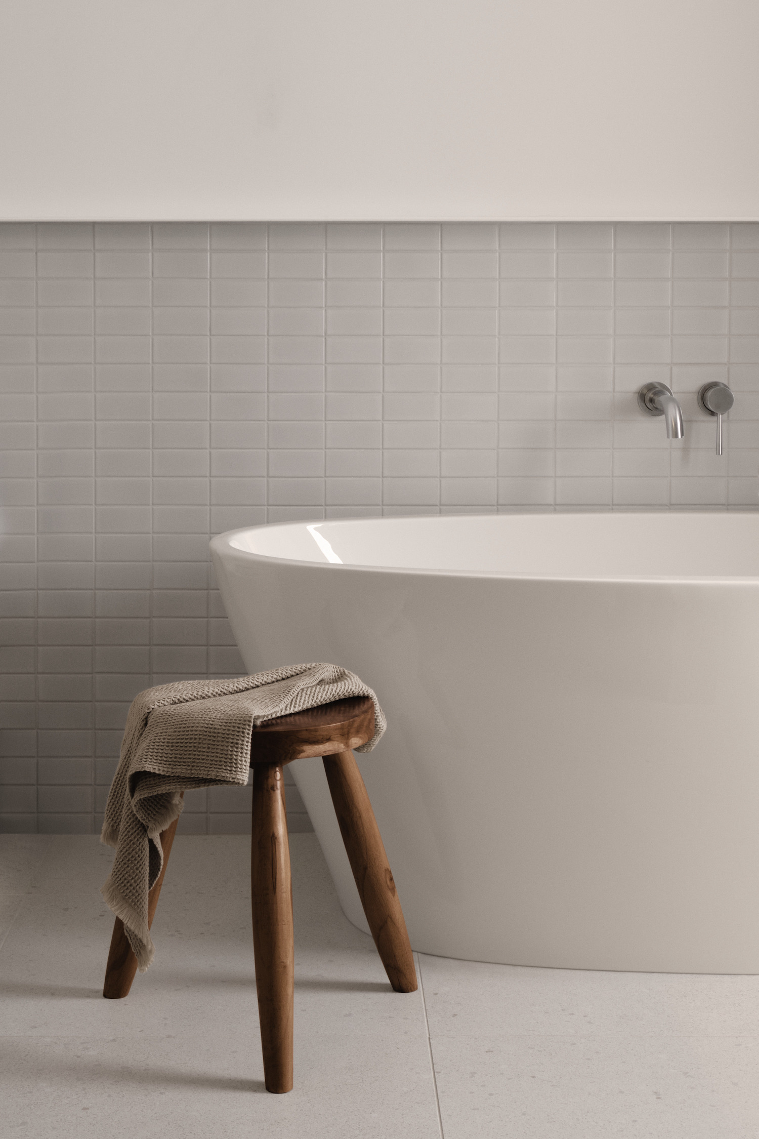
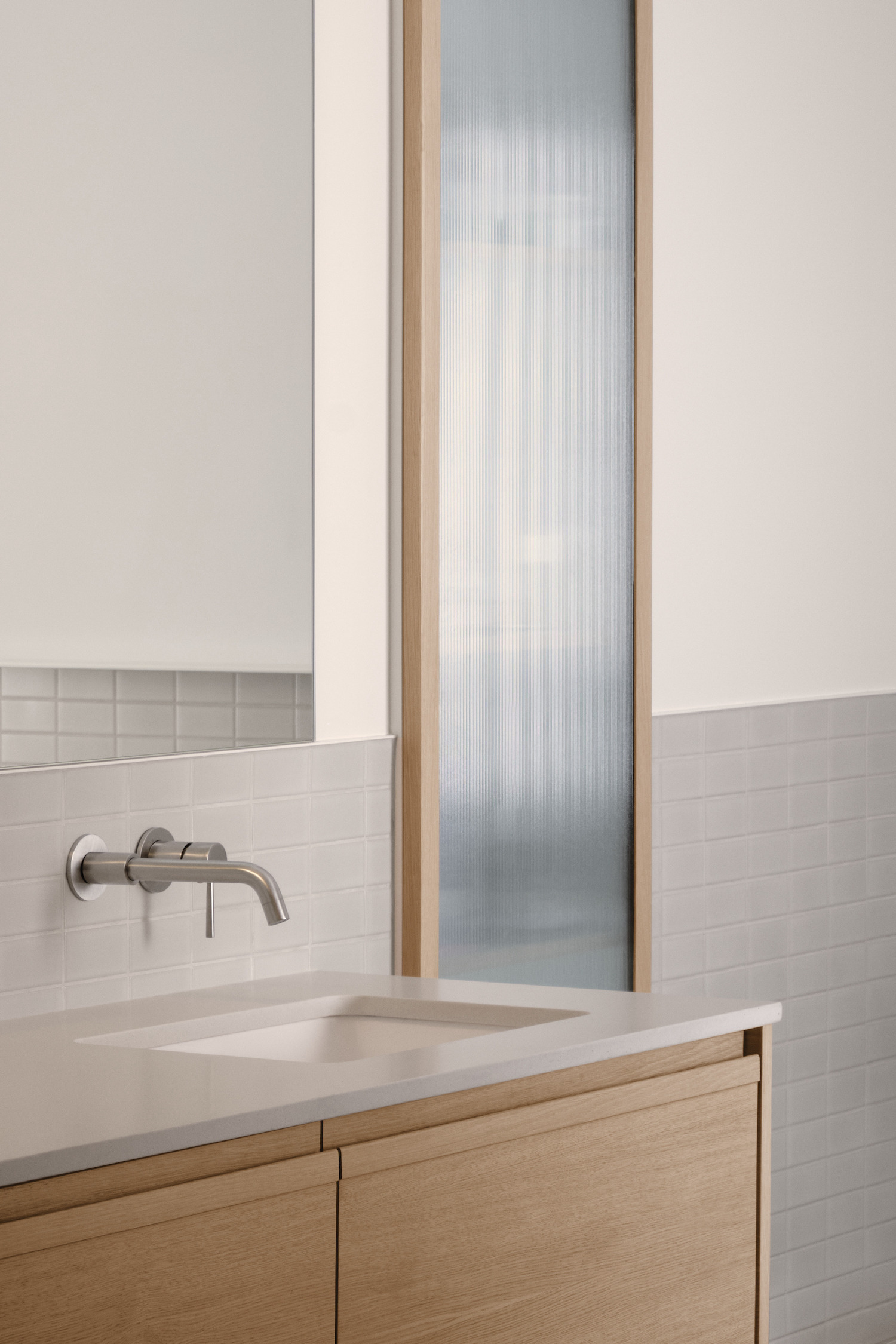
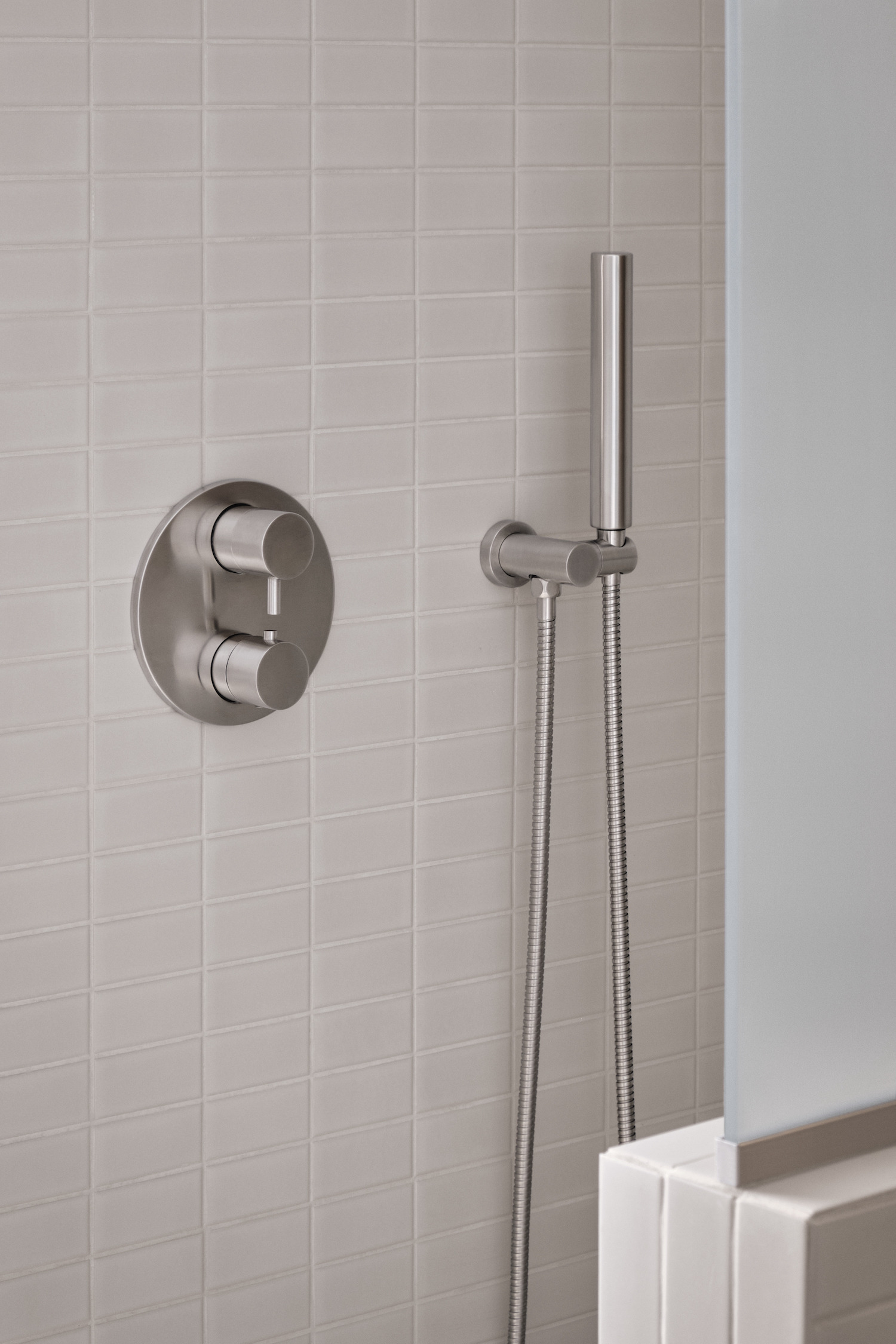
Inspired by urban residences, the design is characterized by the use of natural stone with a unique character and various anthracite and copper finishes. The kitchen is elegant and serves as the centerpiece of the common area, where a symmetrical layout creates clear and simple lines. The bathroom, sober and monochromatic, is enhanced by the custom wood furniture and the textured glass of the wall storage. The use of shades of gray contributes to the soothing atmosphere of the place, which will continue to evolve as the occupants furniture is integrated. The new layout thus respects the charm of the Montreal Plex by adapting it to the contemporary lifestyle.
Photography by Alex Lesage
